

Colour therapy suggests that colours can enhance our mood and wellbeing, much like the benefits of indoor plants. Read our blog to find out more about the Pantone colours for 2021, and how you can use them to enhance your workplace.
2020 brought such an abrupt stop to the world of work as we thought we knew it that it left many facility managers’ heads spinning. The global pandemic forced many businesses to reconfigure existing workspaces, conference areas, and office themes to take into account social distancing and extra hygiene practices. As we move into the new year, we move from the grim reality of 2020 to the possibilities that 2021 has to offer; lockdowns lifted, a vaccine rollout strategy in place, and the hope for a better year for many of us.
Colour Therapy:
Colour is all around us and can have a direct bearing on our mood and wellbeing. It isn’t just a meaningless part of our environment – colour can change the way we feel and react to different situations. Colour therapy uses the powers of colour to heal, energize, and soothe us.
For 2021, the Pantone Color Institute has selected not one, but two Colours of the Year. Ultimate Grey, strong and dependable, stands beside Illuminating, a bright shade of yellow that is symbolic of a fresh start. “The union of an enduring Ultimate Grey with the vibrant yellow Illuminating expresses a message of positivity supported by fortitude. Practical and rock-solid but at the same time warming and optimistic, this is a colour combination that gives us resilience and hope. We need to feel encouraged and uplifted; this is essential to the human spirit.” – Leatrice Eiseman, Executive Director of the Pantone Color Institute.
PANTONE 17-5104: Ultimate Grey – resilient and practical
In 2020, Swiss psychologist, Domicele Jonauskaite, and her colleagues conducted a study during which they examined the relationship between colour and emotion across national borders. Nearly 4,600 participants across 30 nations were asked to match colours to the emotion(s) with which they associated them. Across the board, participants associated grey with emotions such as sadness and disappointment – sentiments that defined 2020.
Nonetheless, in colour therapy, colours are classed as having both positive and negative attributes. Grey does not have to be all doom and gloom. The negative attributes of the colour grey are confirmed by the study above – feelings of loneliness, depression, feeling moody or emotionless. But the positive attributes of grey outweigh those; dependable, practical, sophisticated, timeless, and classic. Ultimate Grey is steady and resilient, instilling the certainty of a firm foundation. After a year of unpredictability and anguish, a little stability might be just what we need.
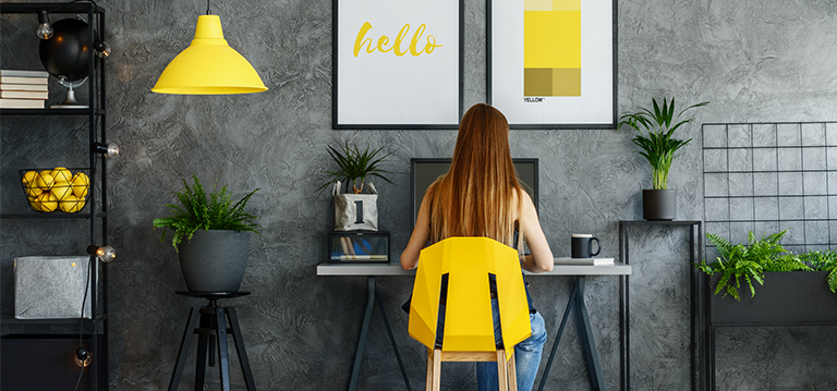
PANTONE 13-0647: Illuminating and positive
A majority of the participants in Jonauskaite’s study paired yellow with joy, and for good reason. You can’t help but feel cheerful when looking at yellow. It’s aspirational and vivacious, and even on a bad day, its hopeful optimism reminds us that there are better ones ahead. In colour therapy, the colour yellow has an energizing and stimulating effect upon the body and mind, relieving depression, melancholy, and confusion.
Due to its long wavelength, yellow is one of the most visible colours to the human eye. Consequently, one would not want to go overboard with yellow elements in a design. But when used properly, the colour yellow can increase mental activity and energy levels in the workplace.
Pantone history:
Only once before have two colours been selected together as Pantone’s “Colour of the Year”. In 2016, Rose Quartz (a blush pink) and Serenity (a light blue) were presented in a gradient to symbolize balance and fluidity during a time of great change for the USA. This year, Pantone breaks from tradition with its first achromatic selection (grey). And unlike in 2016, the two colours are meant to stand alone but complement and support one another.
Over the years, a number of calming blue shades have appeared as Colour of the Year. Contrarily, yellow has shown up only one other time – in 2009. The United States and Western Europe were trying to navigate the fallout of the Great Recession of 2008, another period of time in which people needed a ray of light.

On trend
Colour trends speak to how we respond to events in the world. The uncertainty that characterised 2020 is still here – and shows up in black, grey and white, the ongoing office favourites for renovations and new builds. These colours are not crisp, but instead are slightly muddied with undertones of earthy shades. However, these colours provide a perfect background against which to add shots of colour. Think items such as colourful chairs or plant containers, thus keeping the interior up to date without requiring budget-breaking changes.
The earthier colours mentioned above are paired with natural materials: medium-toned wood, black metal accents, caramel brown leather chairs, and marble streaked with veins of gold or muddy black. All of these colours are a perfect backdrop for the lush green leaves of interior plants, another hot ticket item in 2021 for interior landscaping of large facilities as well as home offices.
A much-needed fresh start
“It’s a combination that speaks to the resilience, the optimism and hope and positivity that we need, as we reset, renew, reimagine and reinvent.” – Laurie Pressman, Vice President of the Pantone Color Institute.
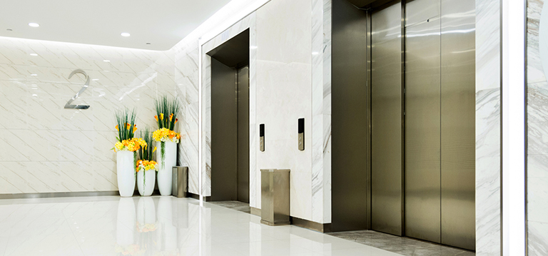
We could all use a clean slate for the new year – 2021’s Colours of the Year are just the beginning. With Ambius as your partners, use the principles of colour therapy to create an environment that enhances colleague productivity and happiness.
Contact Ambius today for a free survey.


Leave a Reply